
SERVICES
UX & UI DESIGN
BRANDING
BRANDING
YEAR
2024
CHALLENGE
NOTE!, a Sonae Group stationery brand, had been showing up in students' lives once a year at back-to-school season. Campaigns ran, products sold, and then the connection disappeared until the following September.
The opportunity was bigger than a campaign. Students, teachers, and parents all orbit the same world but had no single digital place that spoke directly to them. EscolaNote! was built to change that: a sub-brand and platform designed to keep NOTE! relevant to the school community year-round, not just in September.

Research & Discovery
Before touching a single screen, we ran a series of workshops with the NOTE! team to understand the business, the audiences, and the opportunity. We mapped the three core stakeholders, their needs, and their relationship with the brand. We defined personas, explored the competitive landscape, and stress-tested assumptions about what the platform needed to do and for whom. Those sessions were the foundation for every decision that followed.


Building a brand that speaks to three audiences at once
Before anything went on screen, we had to define what EscolaNote! was. That started with a name, a voice, and a visual world built from scratch.
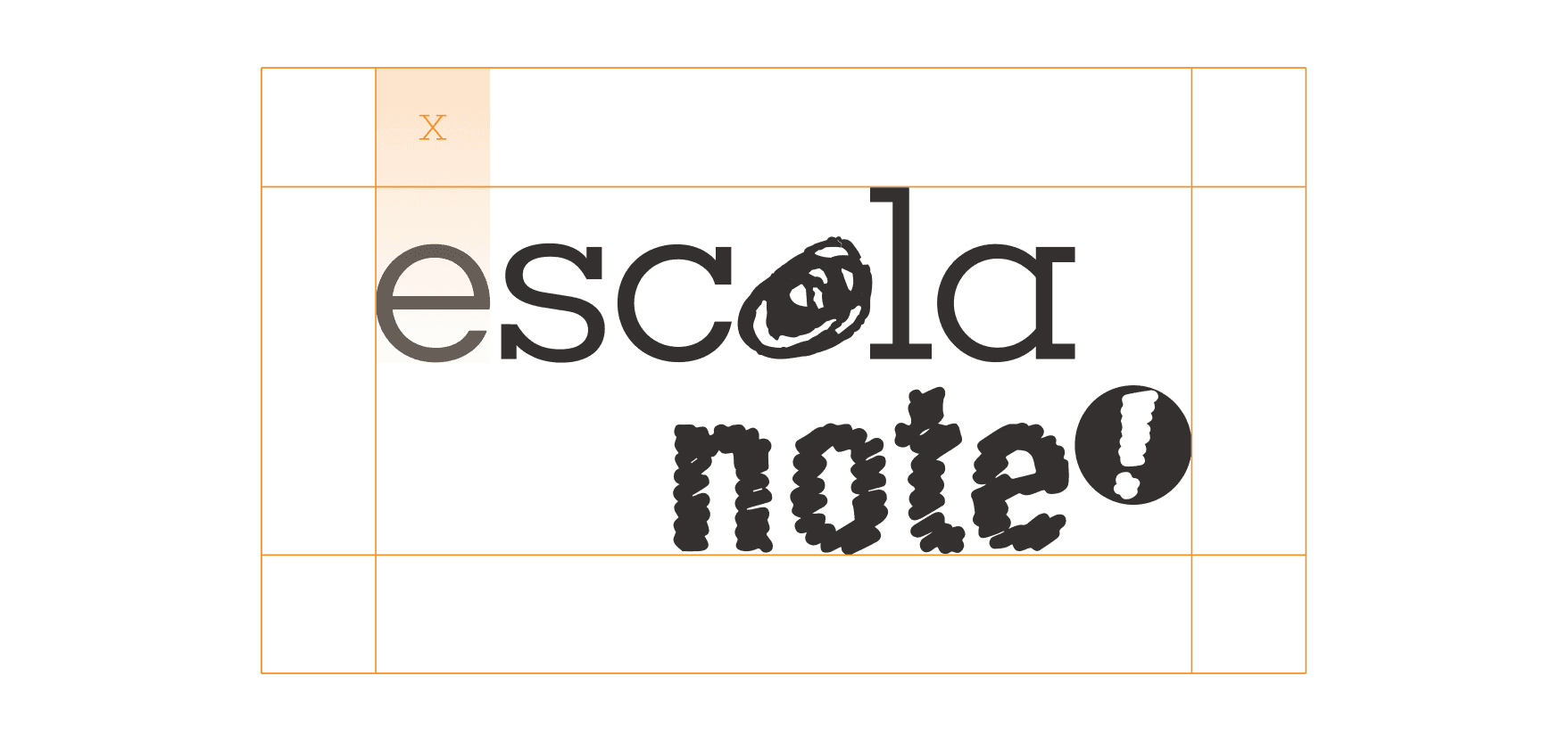
The one deliberate connection to the parent brand is the word "note" itself, written in the exact same typeface as the NOTE! logo. Everything else was ours to define.
The tagline our team landed on was "Tudo menos aulas." Three words that say everything: this is a place for the school community that understands what school actually feels like. It's warm enough for a parent, credible enough for a teacher, and honest enough for a teenager.
The visual identity followed the same logic. Fluid organic shapes, a bold and playful colour palette, and a typographic system energetic enough to feel alive across digital and physical touchpoints, from the platform itself to in-store activations and campaign assets.


Before the platform went live, we designed a two-phase campaign to build anticipation and drive registrations.
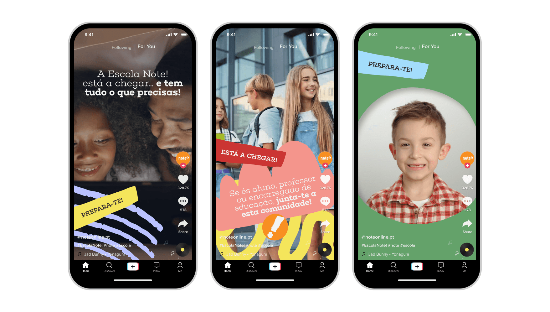
The Pre-launch phase ran from February to March with one goal: make people curious. The message was simple and consistent everywhere. Something is coming. Window vinyls, in-store totems, POS displays, social posts on Instagram, TikTok and Facebook, newsletter sections, and banners in the Continente app all carried the same teaser energy, each piece speaking directly to students, parents, and teachers in their own language.


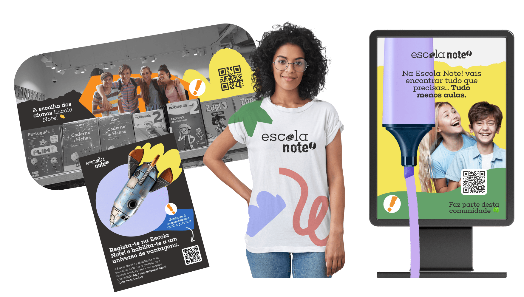
The Launch phase ran from March to June with one goal: turn curiosity into action. The "está a chegar" became "já chegou" across every touchpoint. In-store materials were updated, social content shifted from teaser to celebration, and the Continente app became the activation mechanic — users who registered on EscolaNote could spin a lucky wheel and win discounts of up to 50% on NOTE! products. The phase opened with a launch video that brought the brand to life for the first time, introducing EscolaNote's world, tone, and promise to the full audience. Every touchpoint had a clear path to conversion.
The campaign wasn't just awareness. It was the first proof that EscolaNote had a voice, a visual world, and something real to offer.


Designing a hub, not a store
The platform is where everything came together. Built on Shopify, EscolaNote! is a hub for the school community, not just a store.
Architecture The navigation reflects the full scope of what EscolaNote! offers: Essenciais, Dicas e Conteúdos, Serviços, Workshops, Podcast, Vantagens. Each section has a clear purpose and its own visual identity within the system.
Stakeholder segmentation The most important UX decision was how to handle three audiences with different needs inside a single platform. In the Essenciais section, products are organised by school cycle: 1º Ciclo, 2º Ciclo, 3º Ciclo, Secundário, and Professores. Users immediately find what is relevant to them without having to navigate through content that isn't. The registration form reinforces this from the start, asking users to identify who they are before they even enter the platform.
Beyond e-commerce EscolaNote! is more than a place to buy school supplies. The platform includes a blog with editorial content organised into three categories, a podcast called "Antes que a campainha toque" that covers education, family, and the future of learning, workshops in partnership with brands like Faber-Castell, and physical services available for pickup at NOTE! stores including printing, book covering, and photo printing.
Loyalty and retention The "My EscolaNote!" programme integrates directly with the Continente app. Users earn points with every purchase, exchangeable for discounts through a system the Sonae ecosystem already has in place. It turns one-time buyers into repeat users without building a loyalty system from scratch.


WHAT I'D DO DIFFERENTLY
Accessibility wasn't given the attention it deserved. The pressure of launch timelines meant that colour contrast, text sizing, and screen reader compatibility weren't properly validated before going live. For a platform that serves students of all ages, including younger children and teachers who may have specific accessibility needs, that's a gap that should have been addressed from the start, not left for a future iteration.
Next Case Studie

