
SERVICES
UX & UI DESIGN
BRANDING
YEAR
2023
CHALLENGE
TeamDynamics had three decades of expertise and a strong word-of-mouth reputation, but no brand to show for it. An outdated logo, a website with no visual system, and no way to communicate their social impact. The gap between who they were and how they appeared was costing them credibility and leads.

Full rebuild, not a facelift
The brand audit made one thing clear: there was no identity to evolve. Just an outdated logo and a website with no design rules or visual consistency. Incremental updates would have been a patch on a structural problem. A company with 30 years of market credibility deserved a brand built from the ground up — one that actually reflected the quality of their work. That meant starting with strategy, not aesthetics.


A positioning line bold enough to mean something
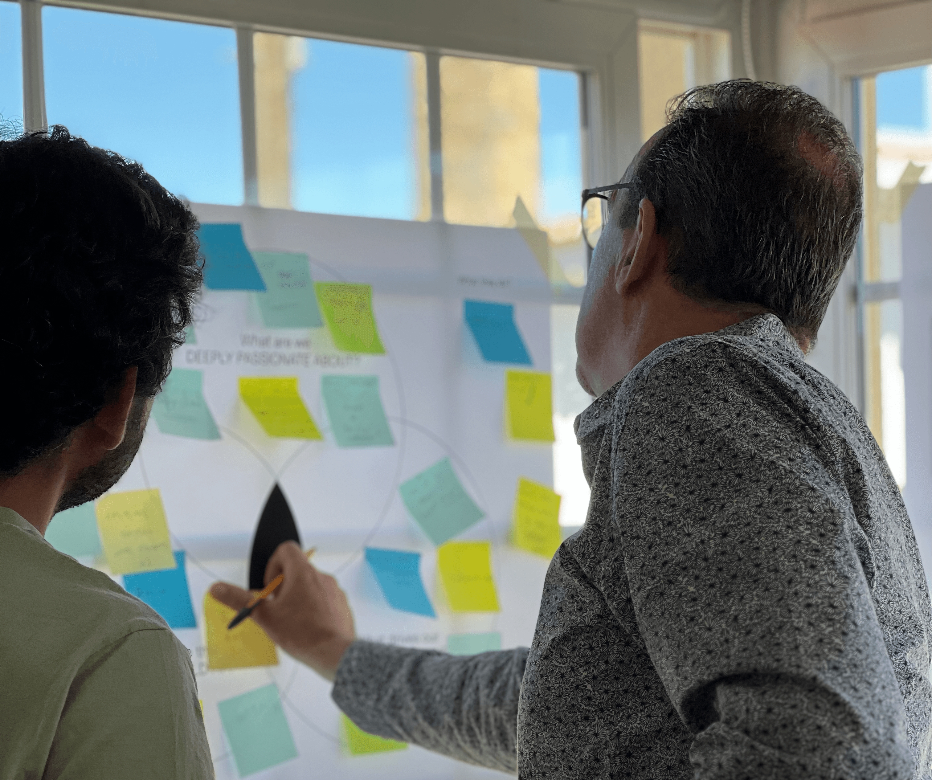
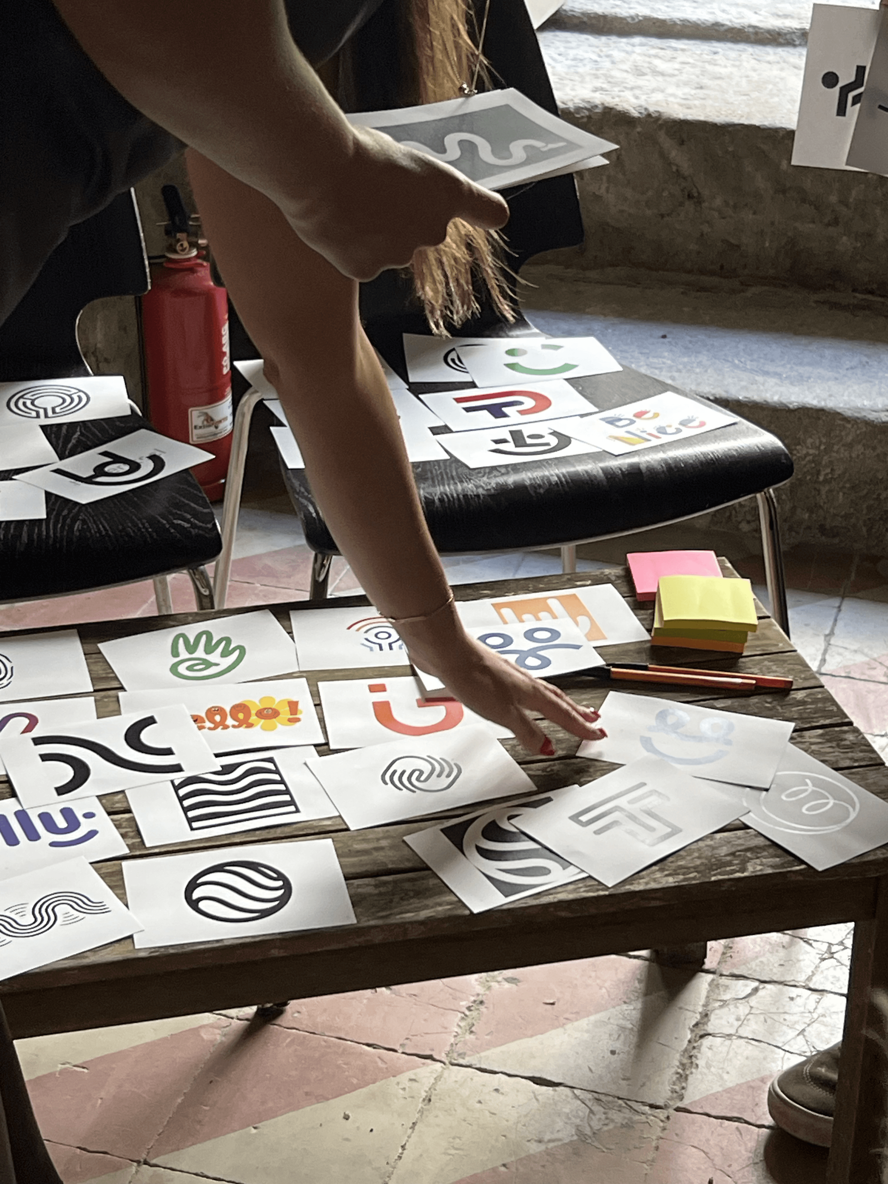
Most team building companies sound exactly the same. Safe, generic, forgettable. To find something true, I ran two workshops with the TeamDynamics team. The goal was simple: strip away assumptions and get to what the brand actually stood for. What did the team believe in, what were they genuinely best at, and how did that compare to everyone else in the market.
What came out was surprisingly consistent. Everyone in the room knew what made TeamDynamics different. They just had never said it out loud. Most team building providers show up, run an activity, and leave. TeamDynamics actually cares about the impact. They embed themselves in their clients' teams, bring real expertise, and refuse to deliver something that doesn't work.
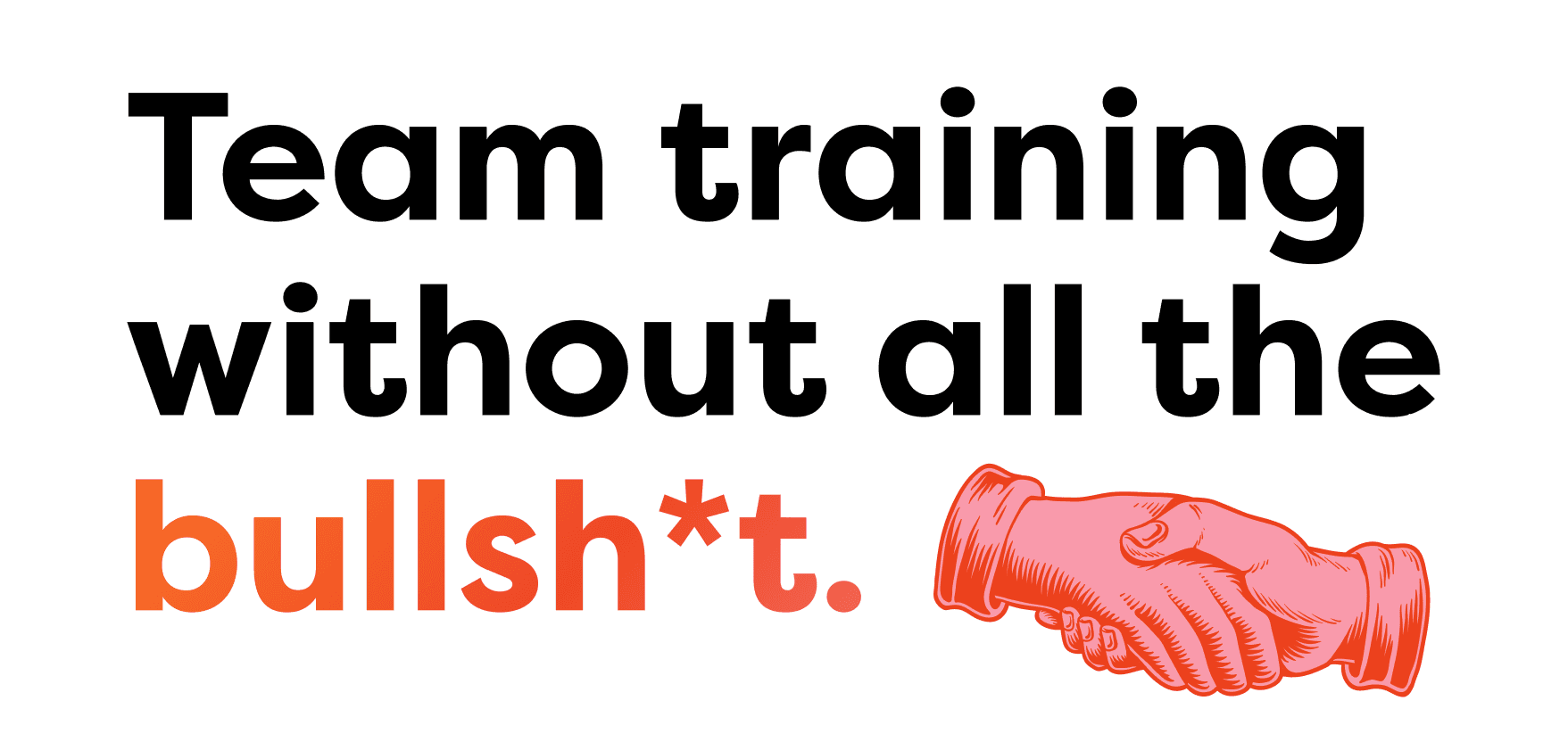
The truth became the positioning: "Team training without all the bullshit."
The client didn't need convincing. They recognized themselves in it immediately. That's usually the sign you've found the right line.




A portfolio of 30+ services is an asset. Presented without structure, it becomes noise and noise kills conversion. A thorough analysis of the existing brand and website made the problem clear: visitors couldn't quickly identify what TeamDynamics offered or whether it matched their needs. Without that clarity, they left.
But this wasn't just a navigation problem. It was a business problem. Working closely with the client, We organized the full offering into five purpose-driven categories: Training, Incentives, Creative, Green + CSR, and Virtual.
Each category maps to a distinct user intent, making it immediately clear where to go and what to expect. More importantly, it allowed TeamDynamics to speak to five different market segments simultaneously, without fragmenting the brand or multiplying the complexity of the website.
Rather than overwhelming users with the full catalogue, each category surfaces only its top 5 services, enough to communicate range and expertise, not enough to cause decision fatigue. A deliberate CTA signals there's more, turning the remaining portfolio into a reason to start a conversation rather than a list to scroll through.
One coherent structure. Five addressable markets. And a catalogue that opens doors instead of closing them.


THE BRAND
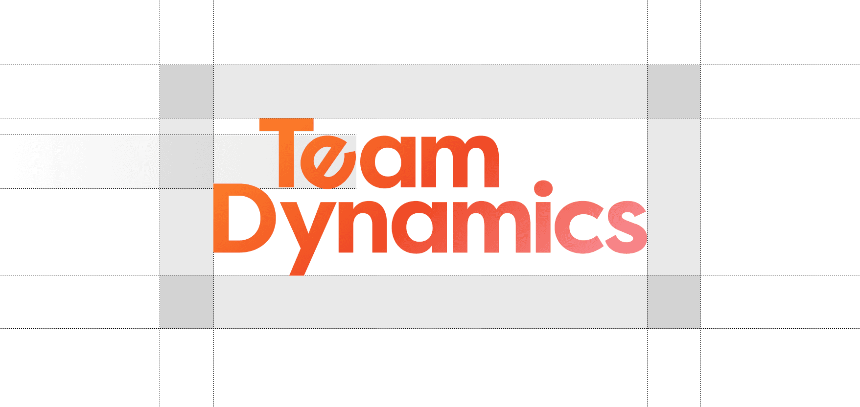
TeamDynamics went from a brand held together by reputation alone to one that finally earns trust on first impression.
Brand System A complete identity built from scratch, applied consistently across 15+ touchpoints: business cards, banners, uniforms, email signatures, and a commercial pitch deck. Every application reinforcing the same positioning.
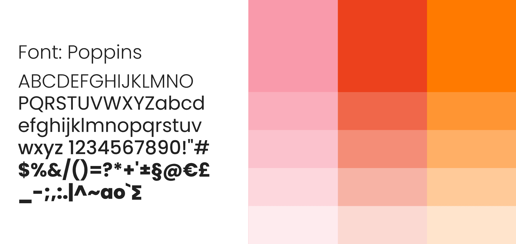


THE WEBSITE
A conversion-focused digital platform that organizes a complex service portfolio into a clear, engaging experience. Built on WordPress in close collaboration with an external developer and refined through usability testing with internal and client teams.
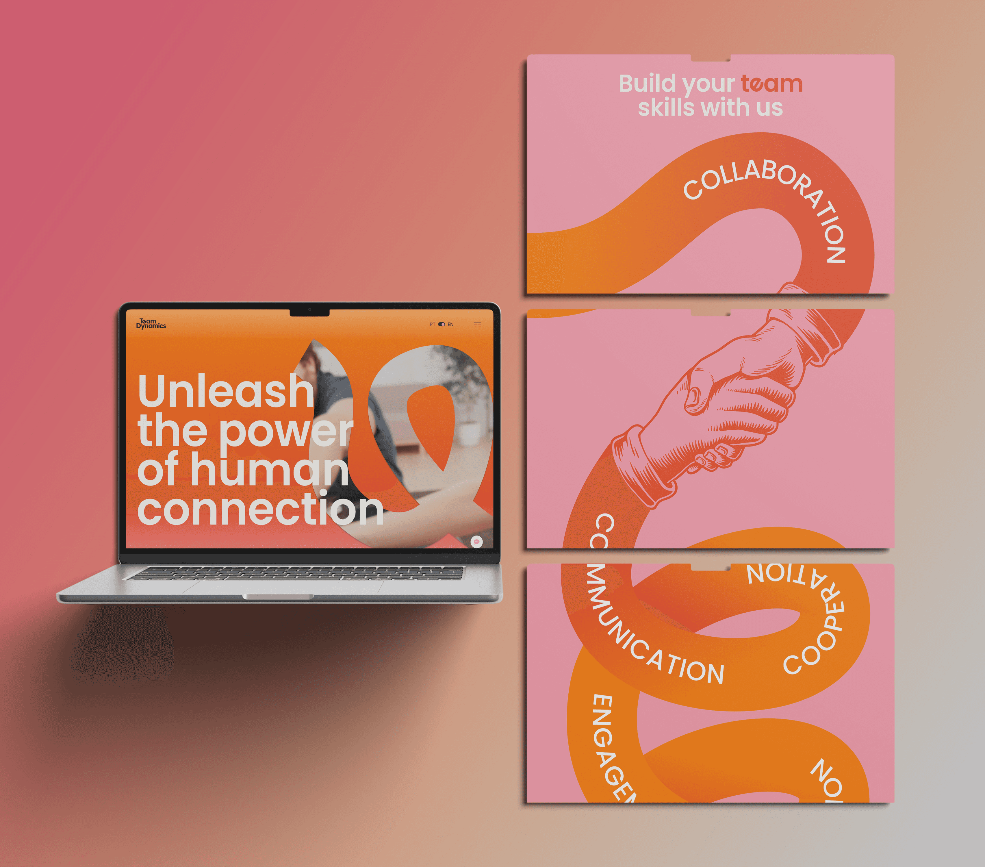


WHAT I'D DO DIFFERENTLY
Running direct client interviews alongside the Google Reviews analysis would have added sharper user insight to the process. Internal workshops are powerful, but external validation earlier would have reduced assumptions and likely surfaced friction points sooner.
Next Case Studie

